Showbie
Facing the unfamiliar, documentation & consistency guide the way toward a formal design system.
When I first joined Showbie, it was like drinking from a firehose; new codebase, new JavaScript framework, new challenges. Invigorating! But it was a small team and there wasn’t a lot of documentation about the existing codebase, which led to things like having several basically similar but slightly different button components, for example.
A significant challenge for the team was the inconsistent color usage between the original iOS app and the up-and-coming web app. This issue was well documented by the mobile, front-end, and design teams in a spreadsheet lovingly titled “Colour Hell 2”.
These two hurdles became my first entrée into the emerging field of design systems.
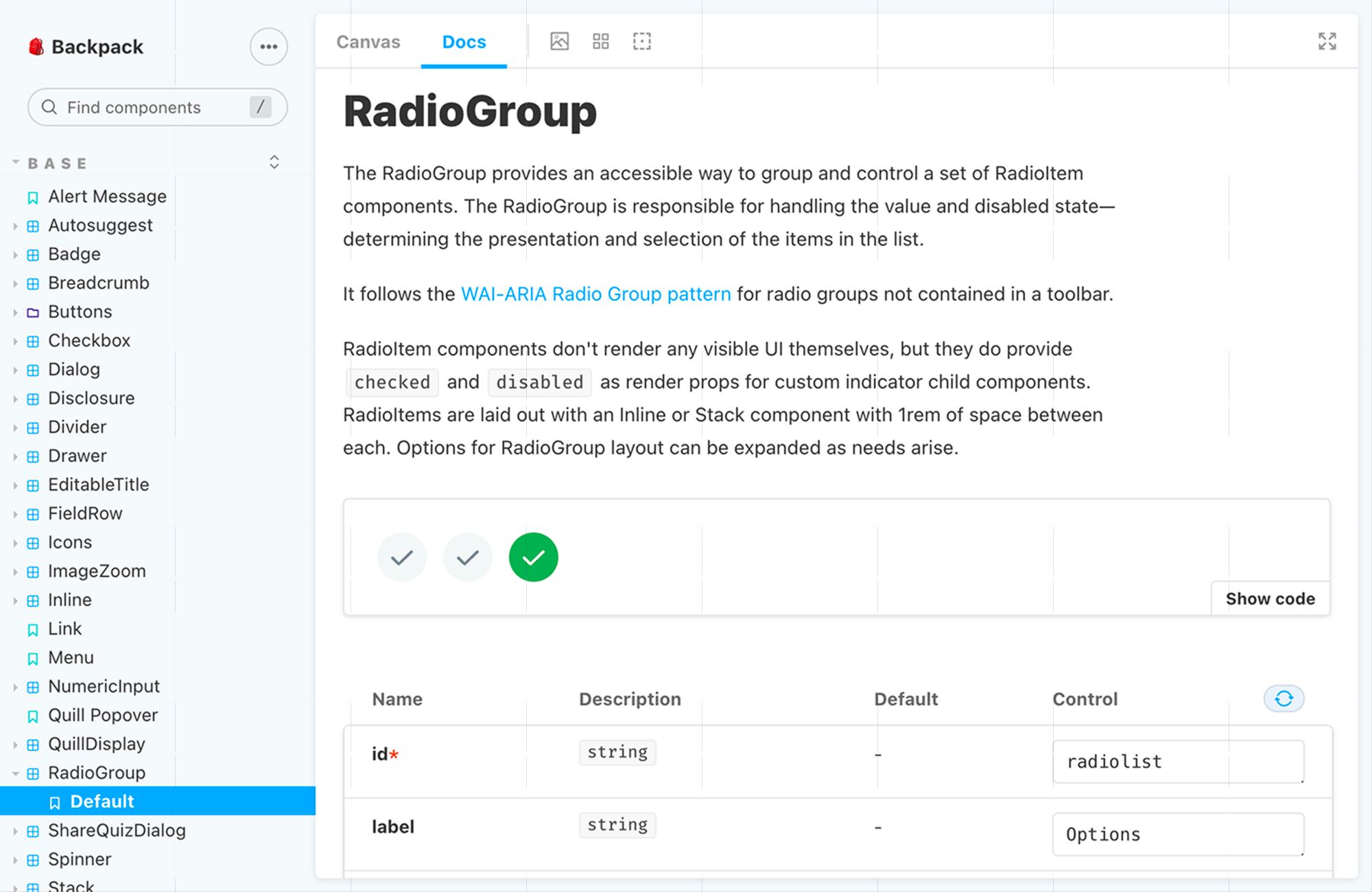
Documentation started out simply; we already had a local script that would build a “kitchen sink” page with examples of components alongside a description so we began making sure this was fleshed out more. Later, when a new app — Socrative — was acquired, I joined that team initially to assist in the initial integration, which involved an updated design for this new app that was more in-line with our existing product.
Since this new app was React-based, we used Storybook for documentation. Once Storybook support for the Ember framework was better supported, we were able to take what we’d done with the React component documentation and get the same benefits for our Ember components.

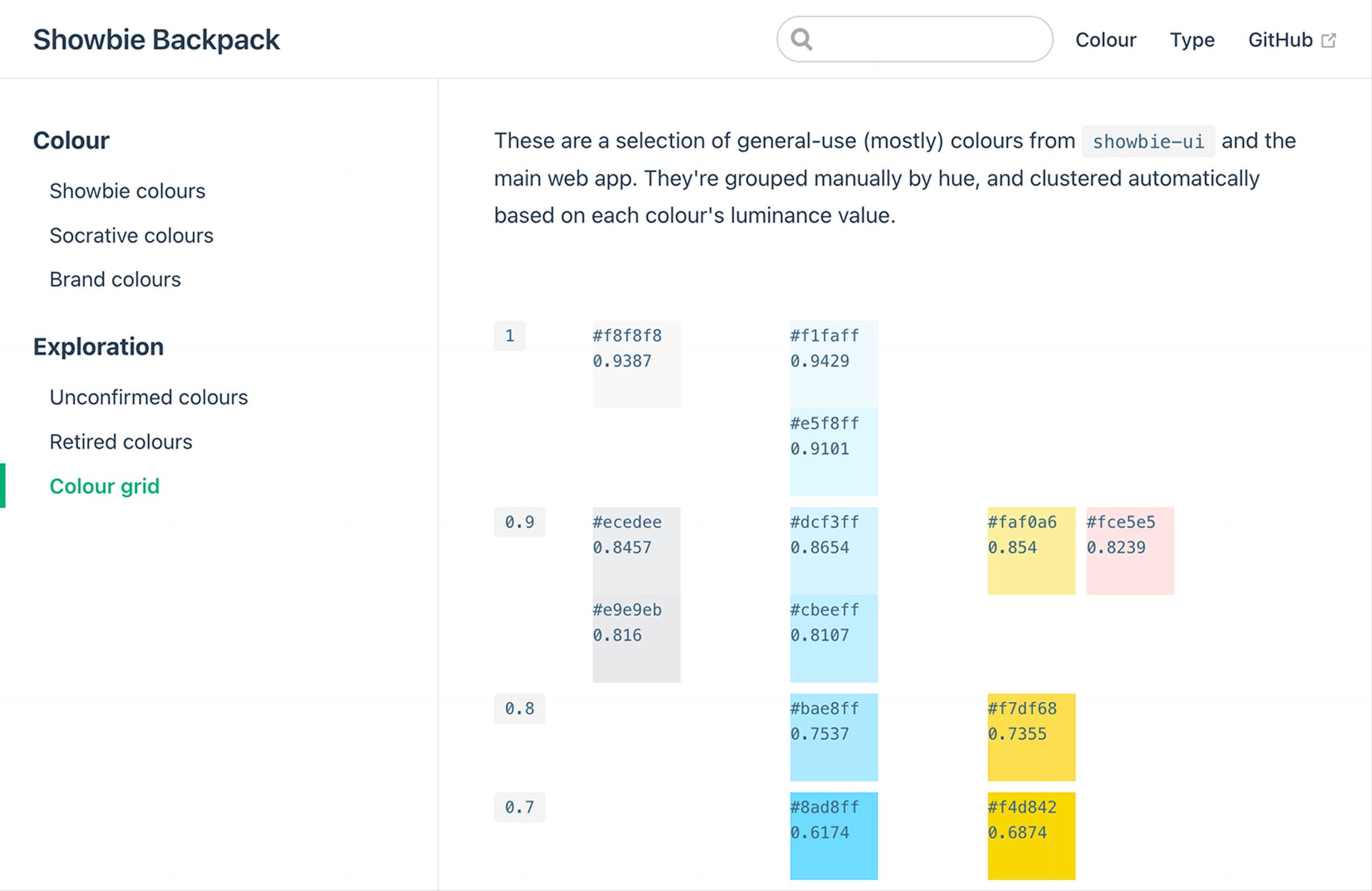
Colour discrepancies were a harder nut to crack. I started by arranging swatches of all the existing colours in a Sketch document along a ten-point scale. This made it easy to see where we had either “gaps” in the scale for each hue, or, particularly with the scale of greys, several shades which were all but indistinguishable.
With the colours arrayed this way, I was able to find a colour that could replace many similar values, without causing a massive shift in the look-and-feel.
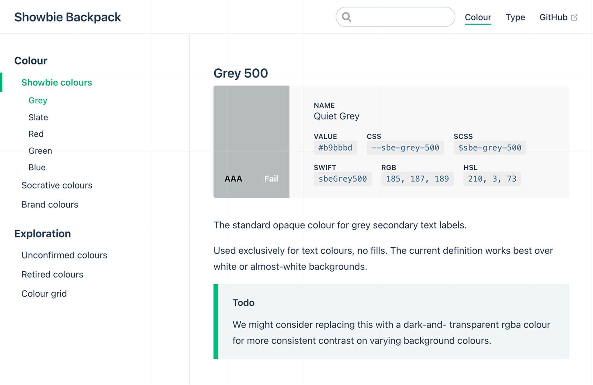
The final piece of the puzzle was how to ensure this newfound consistency didn’t end up drifting away again. I created a separate repo where the colour values could live, and scripts that would export these tokens into CSS and JS formats, as well as the Swift format the mobile team was using. I also added a small custom site to document and display the colour scales to ensure these values weren’t locked away in some unused repo.


While the challenge of a multi-brand design system supporting multiple platforms and JavaScript frameworks was still there, these steps were key in addressing some fundamental areas and setting up a foundation to build upon.